Harmonizing Classical and Contemporary: The Avant Bakery Concept
In the heart of Seoul, within the headquarters building of Daegu Bank in Euljiro, the Avant bakery project unfolds, marking the fourth installment following the success of its predecessors in Seoul Forest D-Tower, Yeoksam, and Kakao branches. Anchored in the essence of bread, the Avant-bakery brand reimagines Korean dessert culture, skillfully balancing classical and contemporary influences. oftn studio, the architectural mastermind behind this venture, ensures the brand’s identity permeates every aspect of the space, seamlessly blending traditional European architecture with modern elements.
Spatial Identity Through Materiality: Aesthetic Fusion
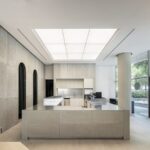
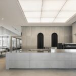
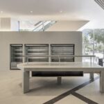
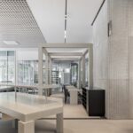
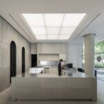
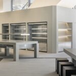
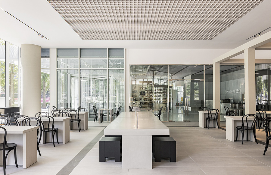
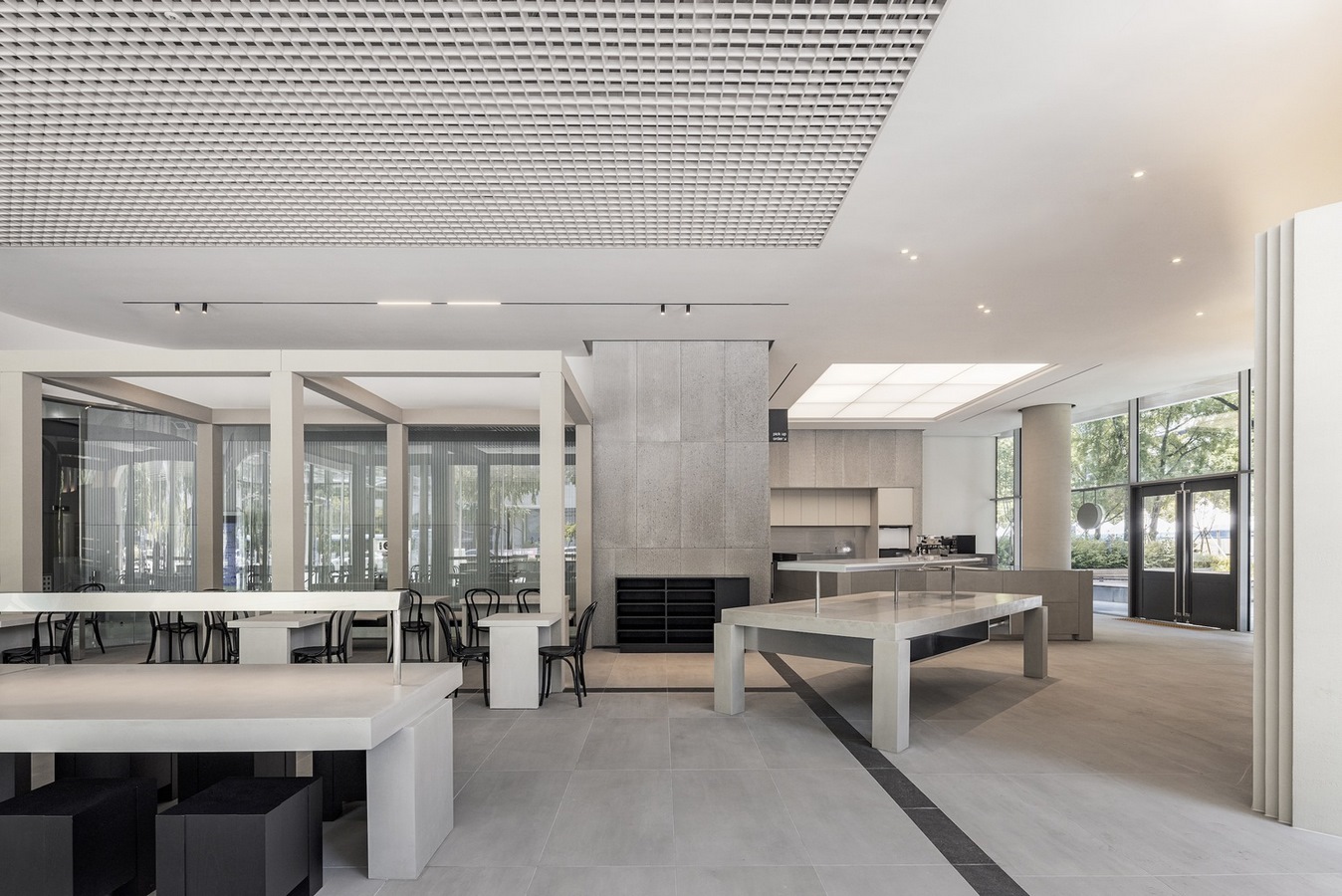
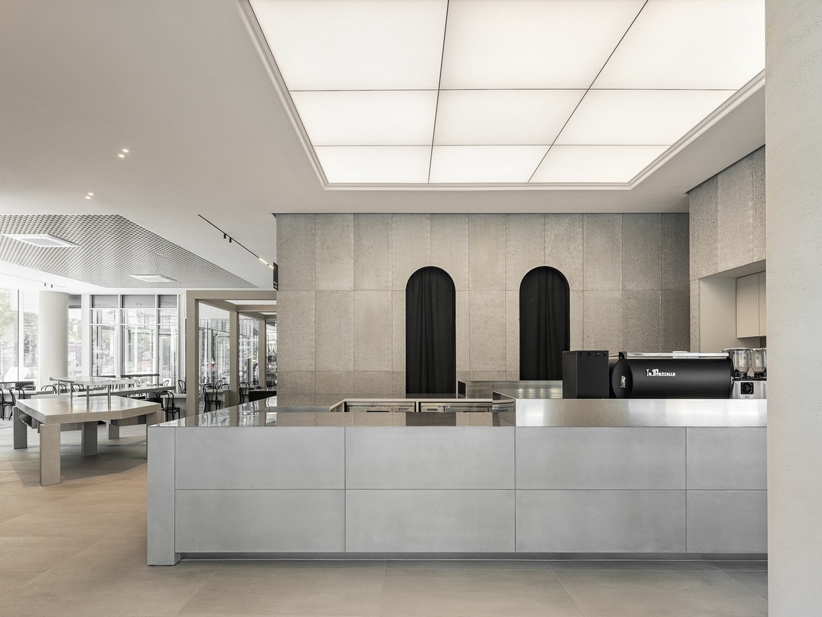
To encapsulate the essence of Avant bakery, the choice of materials becomes paramount. The physical properties of the materials used reflect the brand’s identity, fostering a harmonious coexistence of classical and contemporary elements. The design of the floor pays homage to the square, featuring a patterned lower design. Not merely utilitarian, the counters and bread stands, crafted from concrete, serve both functional and aesthetic purposes, adding an artistic dimension to the space.
Diverse Seating Arrangements: Catering to Varied Preferences
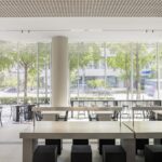
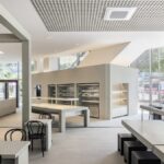
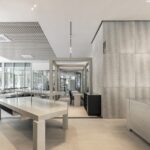
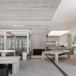
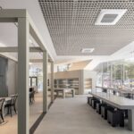
The bakery caters to a diverse clientele, and its spatial design acknowledges this with a thoughtful arrangement of seating options. From bar tables providing an outside view to group stone tables and smaller tables for 2-4 people, the interior accommodates various preferences. This intentional diversity ensures a welcoming ambiance, inviting patrons to savor their bakery experience in a setting that suits their taste.
Visual Minimalism for Psychological Privacy: Pillar and Wall Design
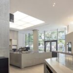
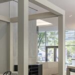
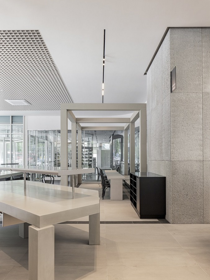
To create a sense of psychological privacy, the pillars are intentionally designed with minimal visualization. The walls, serving dual purposes as kitchen and refrigerated beverage storage, strike a balance by introducing a structural feeling of scale in contrast to the soaring height of the space. This design choice not only delineates functional zones but also contributes to the overall aesthetic appeal.
Efficient Spatial Flow: Enhancing the Customer Journey
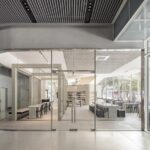
The architects strategically planned the route from the entrance, orchestrating a seamless transition from the coffee bar to the bakery stand and refrigerated beverage stand. This purposeful layout ensures an efficient and enjoyable route for customers, enhancing their overall experience within the bakery.
Achromatic Tones with Textural Depth: Crafting Comfortable Spaces
While embracing an achromatic color palette, the Avant bakery employs various textures and physical properties to infuse the space with comfort and vibrancy. Subtle contrasts, meticulously integrated, create a visually engaging environment that transcends monotony and fosters a sense of joy.
In the Avant bakery by oftn studio, every design choice is a deliberate step toward harmonizing tradition and modernity, creating a space where patrons can indulge in the rich essence of bread while experiencing the delightful synergy of classical and contemporary influences.


